The Creepiness of Green Traffic Lights

Posted: 7 January 2009
| Taken: | 2009-01-07 00:10:19 |
|---|---|
| Camera: | Canon PowerShot A530 |
| Exposure: | -3/3 |
| Aperture: | f/2.6 |
| Exposure Time: | 1/5 |
| Focal Length: | 5800/10 mm |

This work is licensed under a Creative Commons Germany license.
Notes
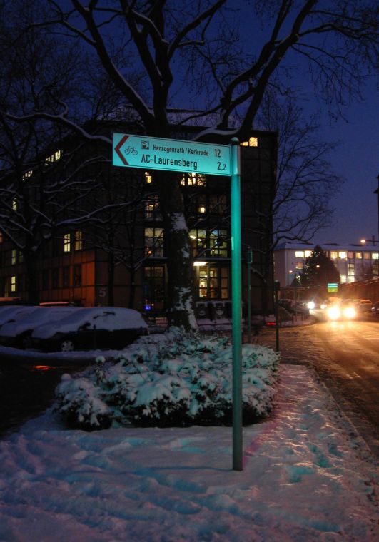
First, let it be known for the record that I like green traffic lights, in fact it’s my favorite color for traffic lights to be in when I’m driving in my car. The green light they give off, however, can look pretty cold and scary when it shines on something else, and I’ve been trying to get a shot of that effect for a few weeks now.
This is the best I could get so far, which is done with my old point-and-shoot that I (try to) always carry around in case something cool appears. I’m not really sold on the shot, though: It’s got the elements that I want and the building (belonging to the RWTH Aachen University, housing institutes for metal refining) gives a nice contrast, but the direction sign just isn’t greenish enough (and my experimentations with Photoshop didn’t yield satisfactory results). I’m also not sure about the car lights at the right edge, I decided to keep them in as a counterpoint but maybe they draw away attention too much. Then again, I do like the sky there.
I’ll probably experiment some more, then with my new tripod, but I’m not really certain how many interesting pictures one can pull out of “Green traffic lights give an interesting light” anyway, so we’ll see how that one works out.
1 Comments
Ulrich Kammer
sehr schönes Bild. Die beleuchteten Autos sollten nicht fehlen, sonst wäre das Bild zu grün.

 Deutsche Version
 Entire Gallery

 Next Picture
 Previous Picture